Let’s talk logos. A logo is important for a few reasons:
- If done well it conveys professionalism.
- If done really well it conveys deep meaning.
- Overtime your customers see it as a symbol of all they think and feel about YOU and your work.
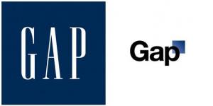
I know what you’re thinking – ‘oh man another thing that I need to figure out’. The good news is that there are online tools that can help you. And if by chance you think the ‘big boys’ have this all figured out – you should realize they don’t. For example, GAP just went thru an epic screw up, which should comfort all of us – they’re human too. If you haven’t heard about this GAP fiasco, you can read this article by Marka Hansen, the GAP President. Then read the second article about how the logo change was a huge disaster.
http://www.huffingtonpost.com/marka-hansen/the-gaps-new-logo_b_754981.html
http://www.huffingtonpost.com/2010/10/12/gap-gets-rid-of-new-logo_n_759131.html
Okay, so how do YOU get it right and check this important issue off your list. Here is exactly what we did to get our logo, and 2 resources you can use.
First, we had a homemade logo we used for the first 6 months of our business. It was simply our name written in Papyrus font, with the first letters capitalized. Here’s the original looking logo:
We weren’t necessarily focused on upgrading our logo, but we were very focused on upgrading our EBay store layout, (we’ll discuss this further in another post). We used Elance.com to find a person who specialized in creating nice EBay store layouts, (his user name is Razor – Nice guy – from London). In that process he asked us for a copy of our logo in a few forms, (like as a png file). We were like, “Huh?”. We had no idea what he was talking about. So, as part of that project we asked him if he could help us upgrade our logo.
He was happy to help us do that and barely charged us anything extra. (I can’t remember how much our total project with him was, but I think it was like $200).
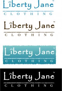
He gave us a few versions, and we kept coming back to things that looked very similar to our original logo. So with his help, we settled on a basic treatment with just 1 special feature – the ‘Crown’ “i”. It’s not fancy, but it conveys something important – Americana. So as a final ‘product’ he gave us the logo in a few forms, so we could use it in lots of ways:
So here are our recommendations for you. First, think about your deep meaning, and come up with a basic idea. Then, (when you can afford it), find a professional graphic artist to help you make it ‘professional’. Need to find a graphic artist? Here are 2 sources we’d recommend:
1. Elance.com. You can place your proposed project on Elance, and graphic artists will ‘bid’. You can see their portfolio, and find someone you are comfortable working with. They are all ‘graded’ as they do projects, so you can be sure of getting someone highly responsible, because the Elance system holds them highly accountable.
2. 99Designs. We’ve never used this, but we really admire the system. You place your project on 99 Designs, and designers actually do the work, and submit it, and you just pick the one you want. You get to see hundreds of styles, all professionally completed, so your creativity can really soar.
If there is anything we can do to be of help when it comes to this topic, let us know.
Jason & Cinnamon


